- Home
- News & Analysis
- Geopolitical Events
- The Aftermath of Brexit – Point & Figure Analysis
The Aftermath of Brexit – Point & Figure Analysis
June 28, 2016Aftermath of Brexit
Today we’ll take a look at the aftermath of the Brexit vote using point and figure analysis.
As we begin to process the magnitude of last week’s ‘Brexit’ vote, it is important to understand that we are still not of the woods yet regarding event risk and market stability. It may well be the start of an extremely volatile period that leaves many areas of the financial markets vulnerable to liquidity issues and potentially large swings. It could be some considerable time before the dust settles, but in the meantime, we’ll use the Point and Figure method to help identify any potential trading opportunities, and analyse the currency carnage that was ‘Brexit.’
GBPUSD
Click for larger view
Let’s start with most affected pair on the day GBPUSD.
Difficult to assess prices at a new 30 year low
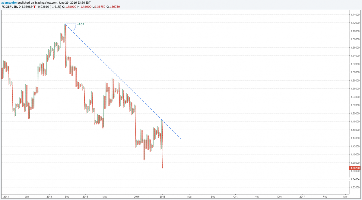
We saw an incredible 10% move from a high of 1.5017 down to a 30 year low of 1.3227. At this point, it becomes extremely difficult to assess when you have relatively little price action to compare it with.
One element that has remained constant is the bearish resistance line as shown in the chart above. This downtrend was tested at those 1.50 highs and held strong just before the referendum vote.
Perhaps a ‘Bremain’ decision would have painted a much different picture, but in this case, the leave vote has only added fuel to the fire, giving the Pound Bears a huge boost in momentum.
While finding areas of support at this moment in time is a tall order, if we look at where the previous supply level ran out on the chart around the 1.40 mark, this provides us with a clue as to what price action could potentially do in the short-term should the Pound see an immediate recovery. I suspect any retracement will consider the 1.40 level as key resistance and possibly even a turning point should price regain some of this lost ground.
XAUUSD
Click for larger view
The next chart we will take a look at is gold.
Gold is leading the charge for safe haven flows
As expected during Friday’s referendum, we saw a rapid increase in safe haven flows. Currencies such as the US Dollar, Japanese Yen, Swiss Franc and also precious metals such as gold, all benefited from traders/investors attempting to park funds into assets that are perceived as financially safer amid volatile environments.
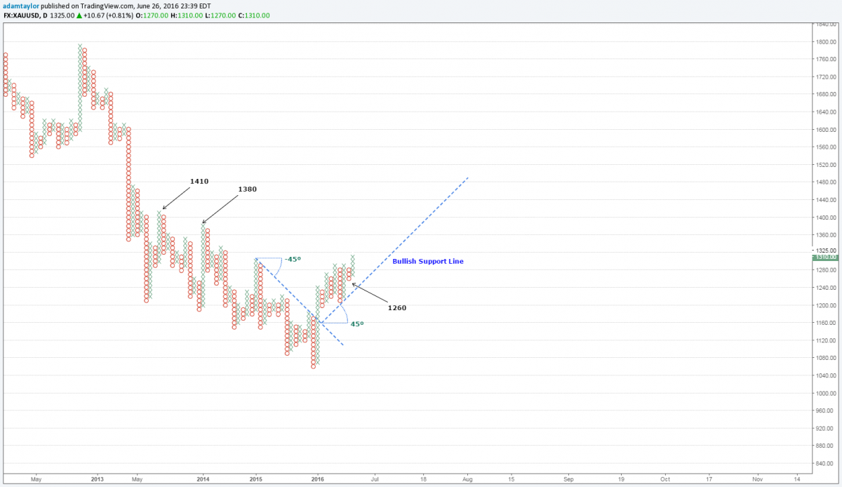
Gold itself moved over USD $100 in price from the lows of 1250 up to the highs of 1358. When we look at the point and figure chart above, it identifies an uptrend (Bullish Support line) that began back in January this year. It’s plausible to imagine that larger market participants have been positioning themselves ahead of this major risk event long before it even took place as gold is commonly used to hedge against these type of market moves.
With the current uptrend firmly intact, an upside target appears to be located in the region of 1400 an ounce. Last time the gold price was at this level was back in March 2014, and given the congested price structure since this period, I think we might see a some staggered moves up to test this area in the short to medium term.
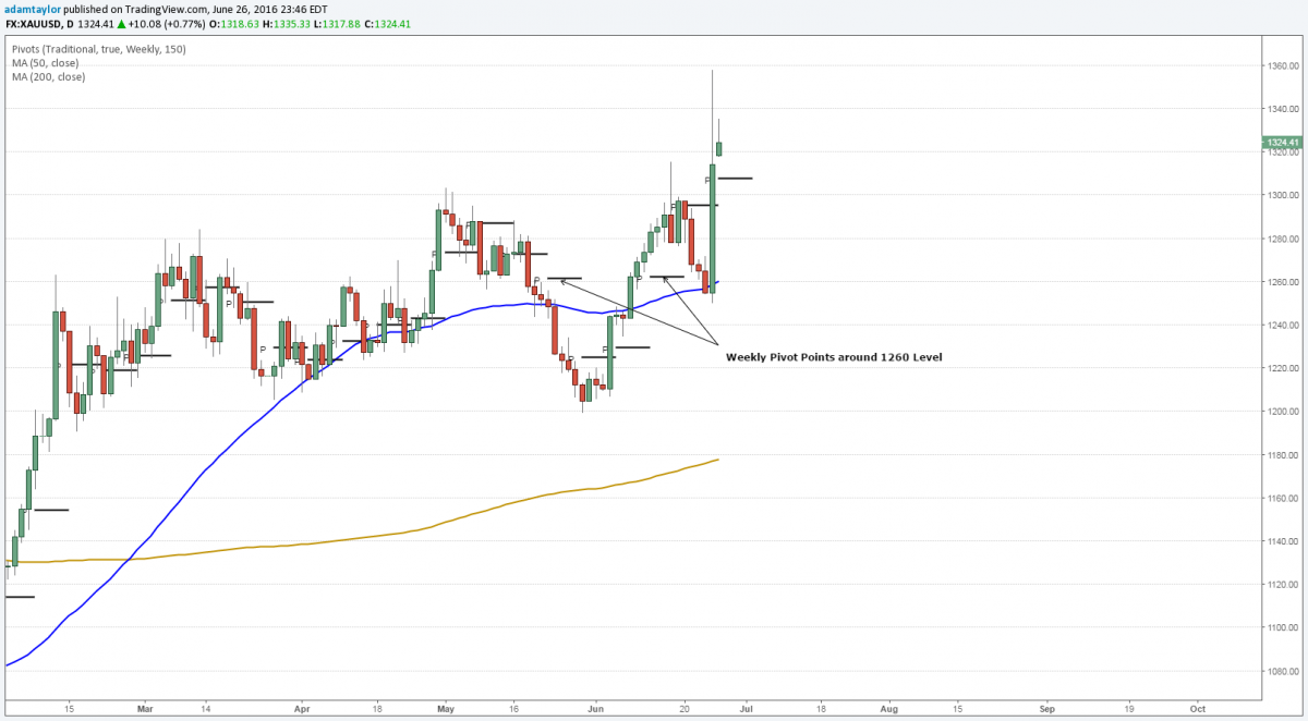
Key support for gold is suggested initially at the round number of 1300, but even below this level, 1260 is shown to have greater importance with multiple weekly pivot points as shown in the candlestick chart below. Also on a brief side note, the yellow line represents the 200 Day Moving Average. As you can see, the price is trading well above this line which provides further confirmation of an uptrend in place.
Click for larger view
AUDUSD
Click for larger view
Finally, a quick look at where the Aussie stands after the onslaught of Brexit.
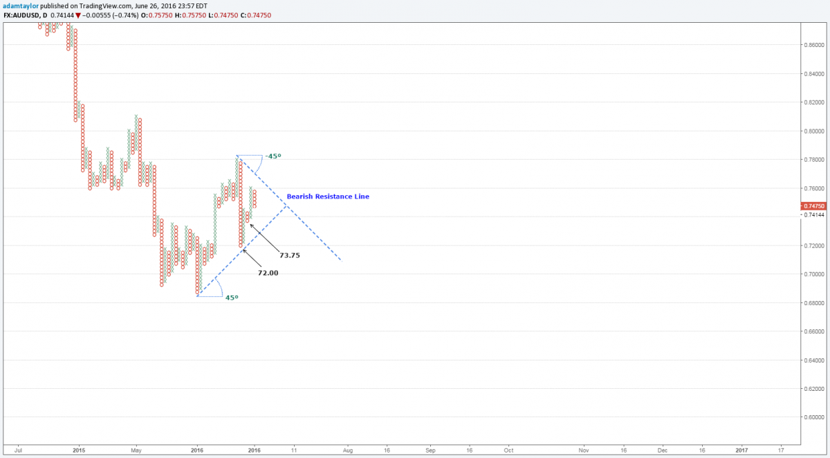
With the US Dollar gaining strength, it was inevitable that the fate of the Australian Dollar would suffer. Recent bullish moves have been slashed, replaced with the familiar sight of a bearish resistance line as shown above.
Bearish pennant formation suggests downward pressure
I’ve left the previous bullish support line visible too as I believe it helps highlight the latest pennant formation on the chart. This triangular structure suggests further downside pressure could be building and during the upcoming days or weeks, the price could test the levels of 73.75 and 72.00 respectively.
A daily close above the 76.00 level would test the current downtrend and is suggestive of a bullish signal. However, until price breaks the 78.00 mark, I’d be inclined to look for selling opportunities in light of recent events.
The theme will be a continued flock to safety
As I mentioned earlier, it will take some time for the financial markets to settle and fully digest what occurred over in Britain last week and many of the implications are still yet unknown.
Let’s not forget with the upcoming US and Australian elections and ongoing negotiations between the UK and Britain emerge, market volatility will more than likely increase and sizable price swings become a regular occurrence.
I suspect we will continue to see continued interest in traditional safe havens like gold and the Japanese Yen, at least until the end of the year.
Please note that trading Forex and Derivatives carries a high level of risk, including the risk of losing substantially more than your initial investment. Also, you do not own or have any rights to the underlying assets. You should only trade if you can afford to carry these risks. Our offer is not designed to alter or modify any individual’s risk preference or encourage individuals to trade in a manner inconsistent with their own trading strategies.
|
Next: Brexit Impact on Global Markets
Previous: Brexit Aftermath Rolls On


